About Me

I am a data analyst student with a strong passion for turning data into actionable insights. Currently, I am seeking an internship opportunity to apply my analytical skills and gain hands-on experience in the field.I am eager to learn and contribute to a team where I can apply my skills to solve real-world problems. Feel free to connect with me!
Technologies
Data Analytic Skills:


• SQL:(SQL Server, PostgreSQL, MySQL) I can confidently write and execute not only basic queries,but also advanced SQL queries to perform data analysis tasks—this includes using subqueries, CTEs, multiple joins, aggregations, and conditional logic with CASE and HAVING and so on.
• Python:(with libraries like Pandas, NumPy, Matplotlib, Seaborn) I’ve completed various projects using Python for data analysis, automation, and visualization—confident in cleaning data, generating insights, and creating visual reports.
• Excel:(PivotTables, advanced formulas, dashboards) I can efficiently analyze and visualize data using PivotTables, complex formulas, charts, and dynamic dashboards.
• Tableau: (dashboards, calculated fields, data blending) I can build interactive dashboards, apply calculated fields, and blend data from multiple sources for insightful visualizations.
• Power BI:(DAX, Power Query, data modeling) I can create reports and dashboards using DAX, model relationships between tables, and transform data with Power Query.
Other Skills:


lastest projects
Furniture Sales(US)

Human Resources

COVID-19(global)

Global Energy Consumption

Moive Sales

jobstreet DataScientist

Coffee Sales

House Prices in Malaysia

Latest Blog Posts
3E Challeges

I have set a personal challenge for myself to continuously upskill and enhance my professional abilities.
Self-Discipline

Two years of consistent fitness training have strengthened my discipline, time management, and resilience, while also improving my ability to handle stress and stay focused on goals
Study Aboard

One year ago, I made the decision to pursue my studies from China to Malaysia. This experience has strengthened my adaptability, independence, and cross-cultural communication skills while expanding my global perspective
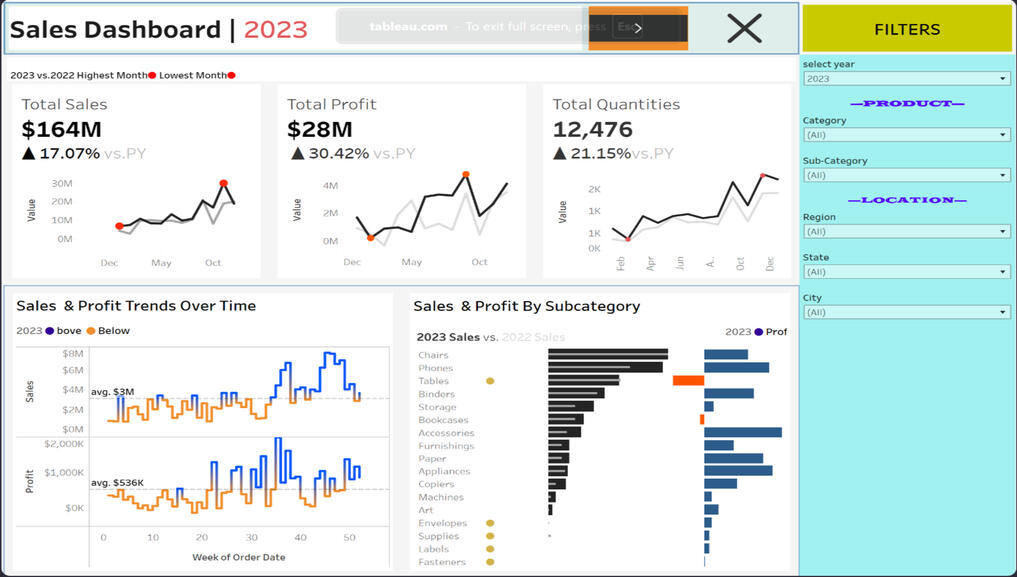
Tableau(Furniture Sales)
🔍 Dynamic and Interactive Dashboard with Advanced Filters
This dashboard provides a comprehensive view of global COVID-19 trends, including total cases, deaths, population infection percentages, and trends over time. By leveraging this data, governments and health organizations can make informed decisions on policy measures, healthcare resource allocation, and future prevention strategies.
Here are the questions I was interested in answering:
1) What are the total sales, profit, and quantities sold for the selected year?
2) How do sales and profit trends fluctuate over time?
3) Which product subcategories contribute the most to revenue and profitability?
4) How do sales and profit vary by location, product category, and subcategory?
5) How does the current year’s performance compare to the previous year?
6) How can users interact with the dashboard to gain deeper insights?
I took the following steps to create my analysis:
1) Designed a dynamic, interactive dashboard where users can filter data by year, category, subcategory, and location (region, state, city).
2) Displayed key performance indicators (KPIs), including total sales ($164M), total profit ($28M), and total quantities sold (12,476).
3) Developed interactive line charts to visualize sales, profit, and quantity trends over time, highlighting peak and low-performing months.
4) Created a comparative analysis section that dynamically updates to show year-over-year performance based on the selected timeframe.
5) Built a bar chart for sales and profit by subcategory, helping identify top and low-performing product groups.
6) Ensured all sections are highly interconnected, allowing real-time adjustments when filters are applied.
Here are my key takeaways:
1) Real-Time Insights & Flexibility:The dashboard dynamically adjusts based on user selections, enabling customized year-over-year analysis.
Filtering by product, subcategory, and location instantly updates all visuals, ensuring cohesive insights.2) Overall Business Growth:Sales increased by 17.07%, and profit rose by 30.42%, indicating strong financial performance.
Total quantities sold grew by 21.15%, showing increased market demand.3) Sales & Profit Trends Over Time:The highest sales months typically occur toward the end of the year (October & December).
Sales and profit fluctuate weekly, with some periods performing significantly above or below the average.4) Product Performance Analysis:Chairs, Phones, and Tables are among the top-selling subcategories.
Some subcategories show negative profit growth, suggesting pricing or cost concerns.5) Highly Interactive & Actionable Data:The ability to filter by region, state, city, and product category allows businesses to tailor strategies for different markets.
The comparative view ensures that performance trends are easily trackable across different years.

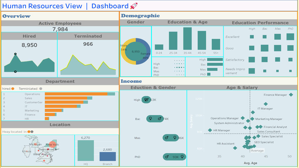
TABLEAU(Humanresources)
🔍 Dynamic and Interactive Dashboard with Advanced Filters
📸Sanpshot of dashboard
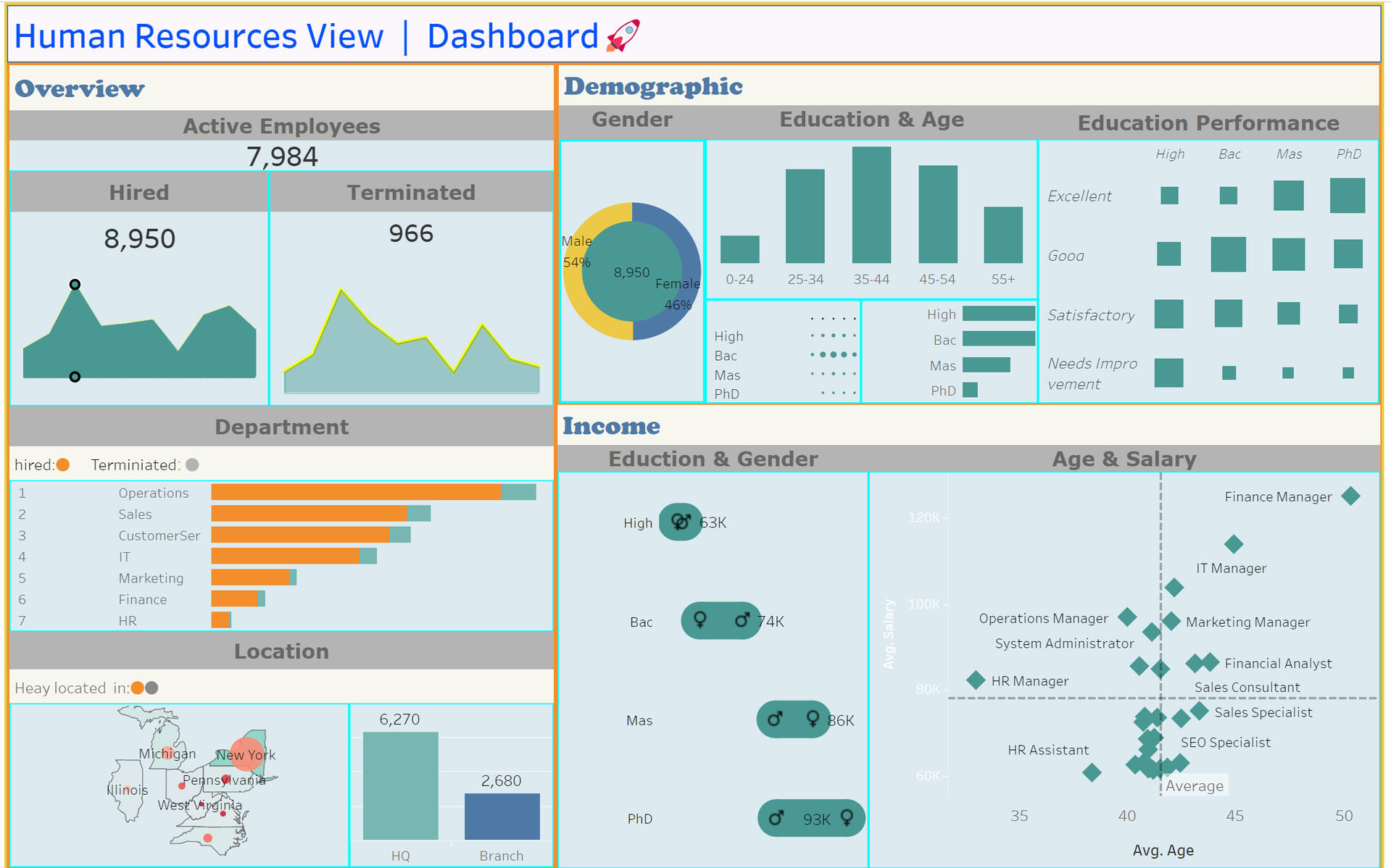
This dashboard provides a detailed overview of workforce trends, hiring patterns, salary distributions, and demographics. The insights can be used by HR leaders to enhance hiring strategies, improve employee retention, and optimize workforce planning.
Here are the questions I was interested in answering:
1) How many employees are currently active in the organization?
2) What are the total hires and terminations?
3)Which departments have the highest hiring and termination rates?
4) What is the gender distribution of employees?
5) How does education level correlate with age and salary?
6) What is the geographical distribution of employees across locations?
7) How do salary levels vary by job roles and experience?
I took the following steps to create my analysis:
1) Collected HR data on employee hiring, terminations, demographics, and salary distributions.
2) Created a summary view displaying the total active employees, hires, and terminations.
3) Visualized department-level hiring and termination trends using a bar chart.
4) Analyzed gender distribution using a pie chart to highlight the male-to-female ratio in the workforce.
5) Mapped employee locations to show where the company has the highest employee concentration.
6) Designed education-based salary analysis to understand how qualifications impact earnings.
7) Created a scatter plot of age vs. salary to identify trends in compensation across different job roles and experience levels.
Here are my key takeaways:
1) Employee Count & Turnover:
The company has 7,984 active employees, with 8,950 hires and 966 terminations, indicating a stable workforce.2) Departmental Trends:
Operations, Sales, and Customer Service have the highest hires, while Finance and HR have the lowest. IT and Customer Service show higher termination rates.3) Gender Distribution:
The workforce is 54% male and 46% female, showing a relatively balanced gender ratio.4) Education & Salary:
PhD holders earn the highest ($93K), followed by Master’s ($86K), and Bachelor’s ($74K). High school graduates have the lowest salaries ($63K).5) Geographical Distribution:
Most employees are in HQ (6,270), with branches having 2,680. Major workforce hubs include Michigan, New York, and Pennsylvania.6) Age & Salary Relationship:
Higher salaries are linked to senior job roles (Finance & IT Managers), while junior roles like HR Assistant earn less. The average employee age is around 40 years.

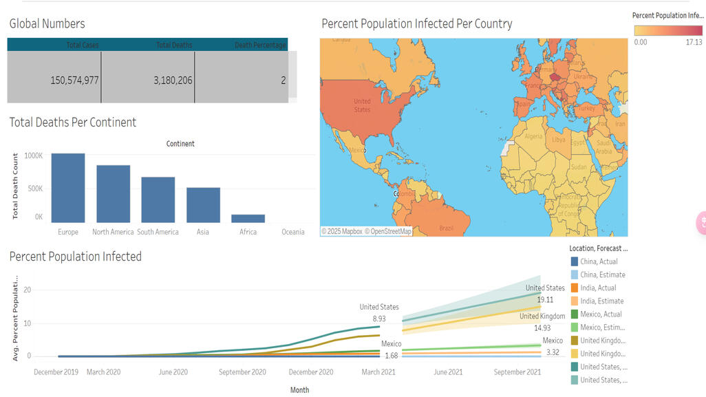
TABLEAU(COVID-19)
🔍 Dynamic and Interactive Dashboard with Advanced Filters
📸Sanpshot of dashboard
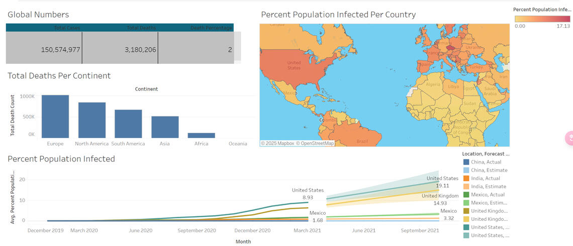
This dashboard provides a comprehensive view of global COVID-19 trends, including total cases, deaths, population infection percentages, and trends over time. By leveraging this data, governments and health organizations can make informed decisions on policy measures, healthcare resource allocation, and future prevention strategies.
Here are the questions I was interested in answering:
1) What are the total reported cases and deaths globally?
2) What is the death percentage based on total cases?
3) Which continent has experienced the highest total deaths?
4) What percentage of the population has been infected in different countries?
5) How has the percentage of the population infected changed over time?
6) Which countries have the highest infection rates?
I took the following steps to create my analysis:
1) Collected global COVID-19 data, including total cases, total deaths, and population infection rates.
2) Created a summary table displaying key global numbers such as total cases, total deaths, and death percentage.
3) Designed a bar chart to visualize total deaths per continent, comparing the impact across different regions.
4) Developed a heatmap to represent the percent of the population infected per country, using color intensity to indicate higher infection rates.
5) Plotted a trend line chart to track percent population infected over time, forecasting potential trends for different countries.
6) Formatted the dashboard for clarity, ensuring key insights are visually distinct and easy to interpret.
Here are my key takeaways:
1) Global impact is severe, with over 150 million total cases and more than 3 million deaths.
2) Europe has the highest total deaths among all continents.
3) The percentage of the population infected varies widely across countries.
4) The heatmap shows that infection rates are concentrated in North America, Europe, and parts of South America.
5) The percentage of the population infected has steadily increased over time.
🔍 SQL Data Cleaning and Analysis(Coffee Sales Database)
😊 Here Are the Questions I Was Interested in Answering (with SQL Queries):
1) What is the likelihood of dying from COVID-19 in Malaysia?
2) Which locations had the highest total deaths in each continent?
3) Which countries had the highest infection rates within each continent?
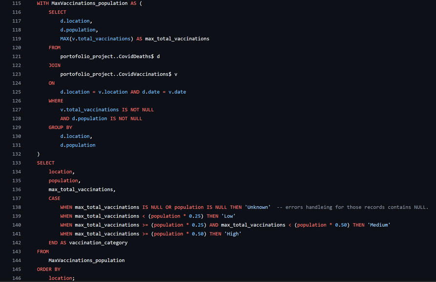
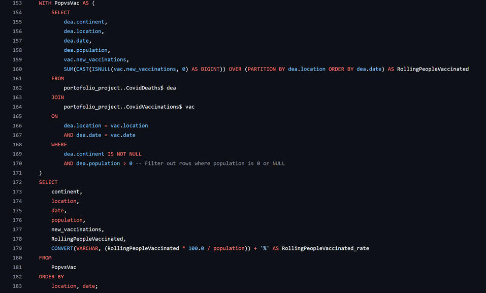
4) How can countries be categorized based on their vaccination rates?
5) How did vaccinations progress over time across countries?
📸some of snapshots:
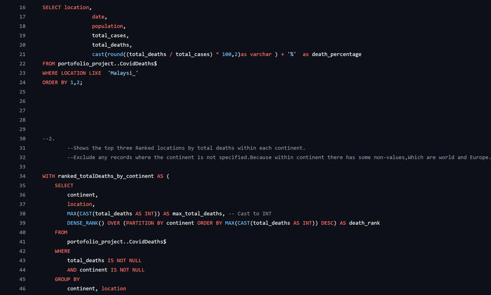
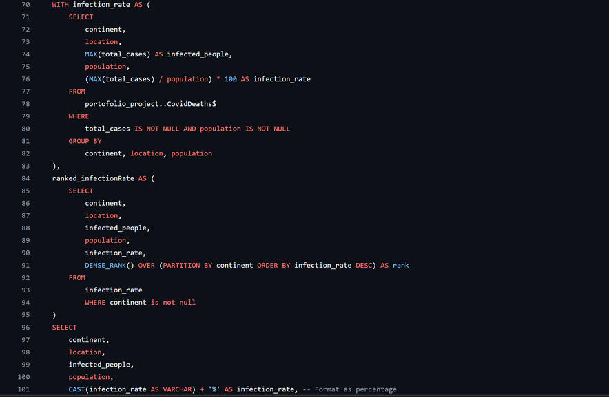
This SQL script demonstrates a complete data exploration and analysis process on a real-world COVID-19 dataset stored in a database called portofolio_project. The workflow includes seven primary stages:
1.Set Database Context
The script begins by selecting the working database caffeesales to ensure all operations target the correct context.
2.Initial Data Exploration
Raw data from three main tables—customers$, orders$, and products$—is explored using SELECT * queries to understand their original structure.
3.Standardize Column Names
For better readability and consistency, column names with spaces or inconsistent casing (e.g., Customer ID, Phone Number) are renamed using sprename to follow a uniform format like CustomerID and PhoneNumber.4.Data Cleaning & TransformationCasts are used to convert data types, while window functions calculate rolling vaccination totals. Non-country data and nulls are filtered out.
5.business insights:● Malaysia's death rate over time●Top countries by deaths and infection rates● Vaccination categories based on population coverage● Progress of global vaccination efforts6.Use of Common Table Expressions (CTEs)
For improved readability and modular analysis, the script uses CTEs like totalproductsales and customer_orders to simplify complex joins and aggregations.
TABLEAU(Caffee Sales)
🔍 Dynamic and Interactive Dashboard with Advanced Filters
📸Sanpshot of dashboard
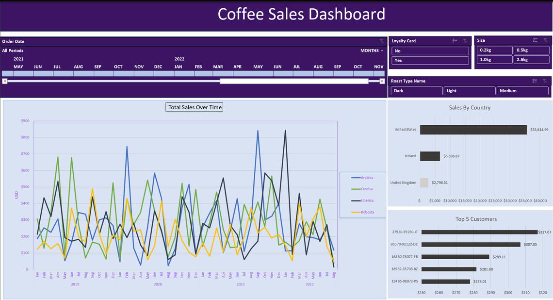
This dashboard provides a detailed visualization of coffee sales trends, key markets, and customer insights. By leveraging the identified patterns, the business can implement data-driven strategies to enhance revenue, optimize marketing efforts, and improve customer engagement.
Here are the questions I was interested in answering:
1) What are the total sales trends over time?
2) Which months experienced the highest and lowest sales?
3) Which countries contribute the most to overall sales?
4) Who are the top customers driving revenue?
5) How do different coffee types (Arabica, Excelsa, Liberica, Robusta) perform over time?
6) How do loyalty card holders and coffee sizes impact sales?
I took the following steps to create my analysis:
1) Collected and cleaned sales data, ensuring consistency in dates, customer details, and product categories.
2) Created a line chart to visualize total sales trends over time, categorized by coffee type.
3) Generated a bar chart to analyze sales contributions by country, highlighting key markets.
4) Identified the top 5 customers based on total spending to understand customer loyalty and purchasing behavior.
5) Implemented slicers for interactive filtering, allowing analysis based on order date, coffee size, roast type, and loyalty card usage.
6) Formatted the dashboard with a structured layout, using distinct color themes and clear labeling for better readability.
Here are my key takeaways:
1) Sales have shown periodic fluctuations, with peaks and drops in different months.
2) The United States is the dominant market, followed by Ireland and the United Kingdom.
3) The top 5 customers collectively contribute a significant portion of sales.
4) All four coffee types (Arabica, Excelsa, Liberica, Robusta) exhibit different sales behaviors.
5) Loyalty cards and coffee sizes provide insights into purchasing behavior.
🔍 SQL Data Cleaning and Analysis(Coffee Sales Database)
😊 Here Are the Questions I Was Interested in Answering (with SQL Queries):
1. What is the most expensive product in the catalog?
2. Which product has generated the highest number of sales by quantity?
3.What are the top 10 products by total income (sales x profit)?
4. Who are the top 10 customers by total spending?
5. Which country has the most customers?
6. Which are the top 3 cities in the United States by number of customers?
7. How can products be categorized by price and profit levels?
8. What is the profit trend over the years?
📸some of snapshots:
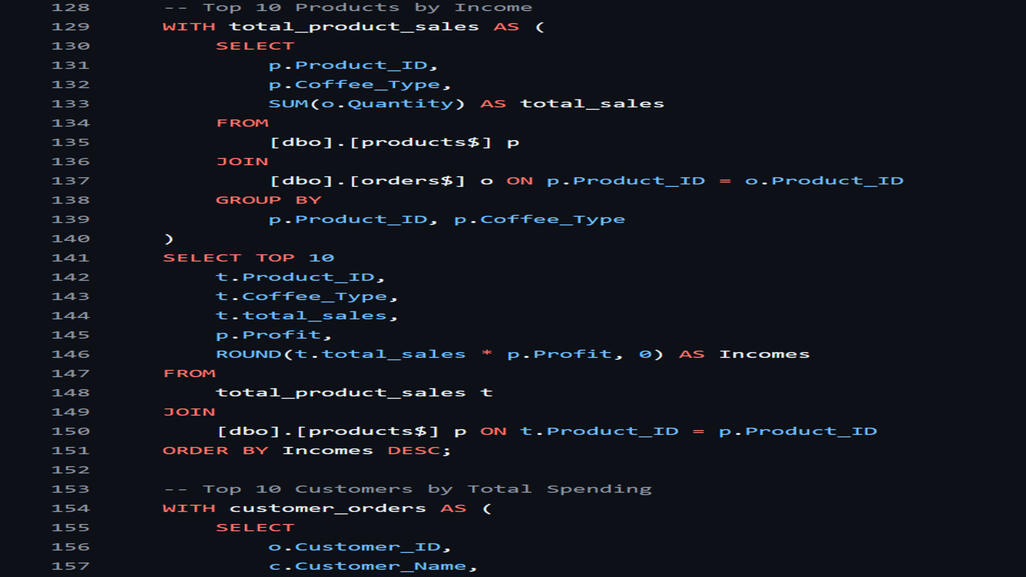
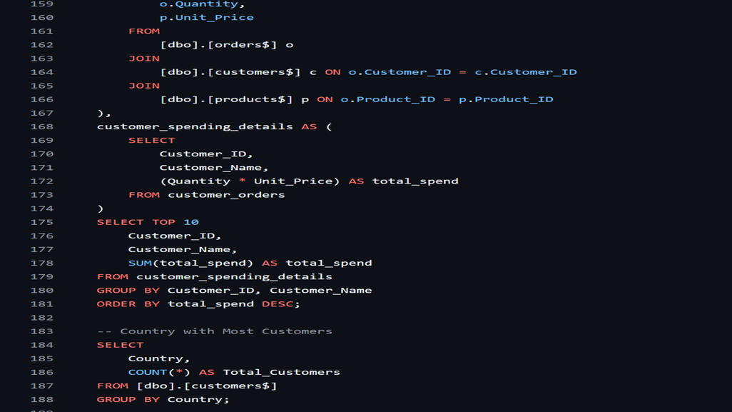
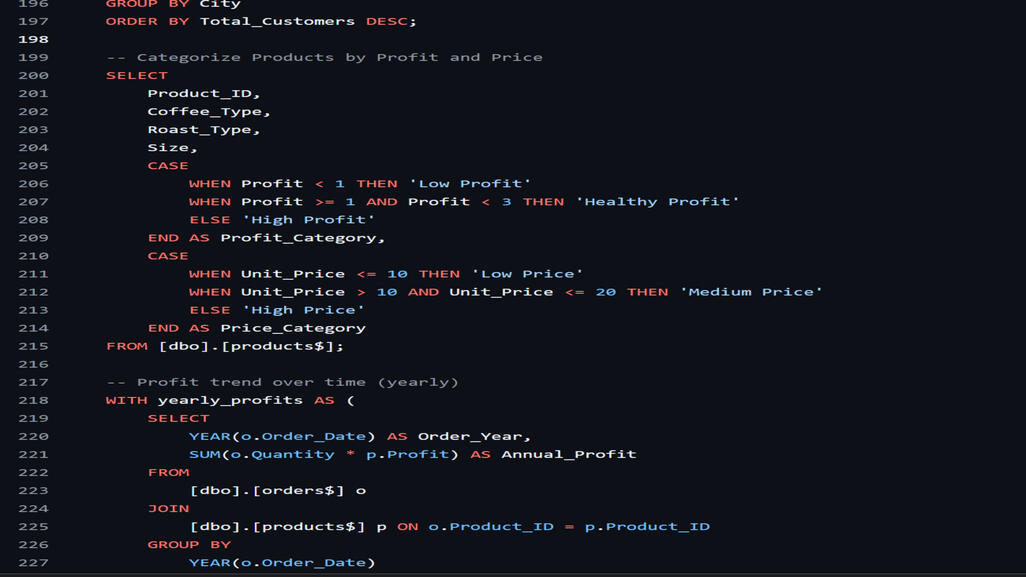
This SQL script demonstrates a complete data preparation and exploratory process on a fictional coffee sales dataset stored in a database called caffee_sales. The workflow includes six primary stages:
1.Set Database Context
The script begins by selecting the working database caffeesales to ensure all operations target the correct context.
2.Initial Data Exploration
Raw data from three main tables—customers$, orders$, and products$—is explored using SELECT * queries to understand their original structure.
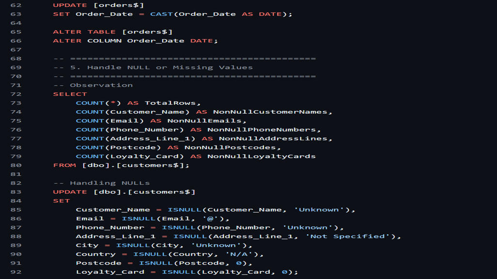
3.Standardize Column Names
For better readability and consistency, column names with spaces or inconsistent casing (e.g., Customer ID, Phone Number) are renamed using sprename to follow a uniform format like CustomerID and PhoneNumber.4.Data Cleaning & Transformation1>Redundant Columns: Unnecessary columns from orders$ are dropped to reduce noise in the dataset.2>Data Type Conversion: The OrderDate column is explicitly cast and altered to the DATE data type for consistency in temporal analyses.3>Handling Missing Values: Null or incomplete values in the customers$ table are replaced with default entries (e.g., 'Unknown' or 0) using the ISNULL() function.
Business Insights & Analytics A series of analytical queries are executed to uncover valuable
5.business insights:● Identify the most expensive product.● Determine the top-selling products by quantity and income.● Highlight the top 10 customers by total spending.● Analyze geographic trends such as the most customer-rich countries and top US cities.● Categorize products based on profit and price tiers.● Show year-over-year profit trends using aggregated profit data.Use of Common Table Expressions (CTEs)
For improved readability and modular analysis, the script uses CTEs like totalproductsales and customerorders to simplify complex joins and aggregations.
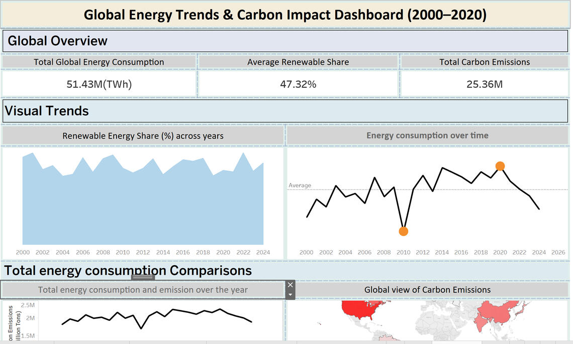
TABLEAU(Global Energy Consumption)
📸Sanpshot of dashboard
GYM JOURNEY
"My commitment to fitness over the past two years has strengthened my discipline, goal-setting, and time management skills. Through consistent training, I’ve developed a resilient mindset, learned to manage stress effectively, and gained the confidence to face challenges in both academic and professional environments."
📸The initial version of me

One and half years later:


I have learned a lot from this jounery, it taught me discipline,consistency,time managment,Self-Motivation,Resilience & Patience,I am apperciate that I have made this decision at that time.